Username:    Password:   
 :: Klaus ::
« Profile »
[« previous member (ace of hearts) | list all members | next member (foxracing) »]   
 
Country:  other Homepage:  N/A
Member Since:  10th March 2005 Email:  N/A
Fan Art Images:  28 Yahoo Messenger:  N/A
Fan Fiction:  0 ICQ UIN:  N/A
Profile Views:  897 Last Seen:  13th July 2005 11:39.16
Comments:  

[Show scraps/old art]

« Fan Works By Klaus »

Jump To Page: [ |1| |2| |3| ]

Balto
Klaus
Quick-rating: [85% out of 6 votes] Date added: 11th March 2005
Quick-rate: Last viewed: 27th January 2006
Views: 220
 Reviews:
  Reviewer: Greykitty Date: 6th April 2005 10/10
 Again I love the shading and detail on this. :)
  Reviewer: bhb Date: 6th April 2005 10/10
 Im in awe.
  Reviewer: silver_balto Date: 7th April 2005 8/10
 This picture is so cool! It's like you drew Balto like the movie was animated in the 1920s! Great Job!
  Reviewer: Rail Wolf Date: 9th April 2005 9/10
 Wow He looks Vary Fluffy. I love The shading. Nice poeace of work
  Reviewer: Date: 10th July 2005 10/10
 wow!his body is very realistic-and his head and face is very origanal-i love it!
Balto
Klaus
Quick-rating: [100% out of 3 votes] Date added: 11th March 2005
Quick-rate: Last viewed: 27th January 2006
Views: 215
 Reviews:
  Reviewer: Greykitty Date: 6th April 2005 10/10
 I really love the detail in this. The shading is great!
  Reviewer: wolf Date: 6th April 2005 10/10
 i love how you've shaded the muscles! Agreat piece of artwork!
  Reviewer: Date: 6th April 2005 10/10
 I told ya'll is art is among the best there is.
  Reviewer: bhb Date: 6th April 2005 10/10
 AWESOME
  Reviewer: wolfdog 101 Date: 8th April 2005 [comment]
 wwwwwwwoooooooooooowwwwwwwwwww
  Reviewer: Wolfy108 Date: 9th April 2005 10/10
 Yeah, the shading's really great. ^_^
  Reviewer: blahblah Date: 9th April 2005 10/10
 see? Klaus can draw. awesome pic. it looks like balto but has a realistic thing going on. must have been hard to pull off.
Steele
Klaus
Quick-rating: [56.67% out of 3 votes] Date added: 10th March 2005
Quick-rate: Last viewed: 20th January 2006
Views: 95
 Reviews:
  Reviewer: silver_balto Date: 4th April 2005 10/10
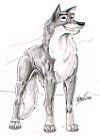
 This is a lot better. It looks like a graphic from a sweatshirt. Why don't u make a shirt with that on it? Anyway, nice job!
  Reviewer: Greykitty Date: 4th April 2005 4/10
 It's nice, but again it looks like another photomanip. The shading is a nice touch though.
  Reviewer: Silver_Huskie Date: 4th April 2005 9/10
 Why do I give a 9/10, well i'll tell you. First of, you haven't made this into a shirt that you can buy anywhere! And second off because there is a minor wierdness at the bottom of the pic that looks a bit...cut off? I don't know it just looks like there should be more at the bottom.
  Reviewer: Wolfy108 Date: 4th April 2005 3/10
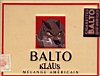
 Yet ANOTHER screenshot edited in PS...the shading and writing in the corner are the only things that stop me from giving you a 1/10.
  Reviewer: Date: 4th April 2005 10/10
 The thing here is, is that most of Klaus's art is WAY to mature for 9/10 of the people on this board, so his generic art is up. I've seen almost all of Klaus's stuff, and most of it is pretty impressive.
  Reviewer: redwolf03 Date: 5th April 2005 7/10
 Oh, what the heck? I'll give you a 7/10.
  Reviewer: bhb Date: 5th April 2005 3/10
 I find photoshop not an art, but a skill...im kinda afraid of were alpine might have been going in terms of his other work.
  Reviewer: Date: 5th April 2005 [comment]
 Some of Klaus's older clean art is some of the best you'll ever find, period. If I can find a pic, I'll post the link in the shout board.
  Reviewer: Date: 1st May 2005 10/10
 great steele .
Balto
Klaus
Quick-rating: [30% out of 9 votes] Date added: 10th March 2005
Quick-rate: Last viewed: 7th January 2006
Views: 131
 Reviews:
  Reviewer: Greykitty Date: 4th April 2005 2/10
 Photomanip, so I'm not giving it a high rating.
  Reviewer: bhb Date: 4th April 2005 1/10
 I can use photoshop too.
  Reviewer: Kitten Date: 5th April 2005 9/10
 OMG!! Lighten up people! Art is a personal thing.
  Reviewer: Dark_Wolf Date: 5th April 2005 8/10
 Yeah, lighten up. We are not looking at the concept of drugs. We are only here to veiw how Klaus did this. Anyways it is just artwork, not something in real life.
  Reviewer: Yukon Date: 6th April 2005 [comment]
 Everyone who has rated this fan art: please read my topic about this in the forum at inte_forum.asp?board=6&topic=10
  Reviewer: blahblah Date: 9th April 2005 [comment]
 sheesh u guys need to lighten up.
  Reviewer: rail wolf Date: 11th April 2005 [comment]
 I just read Yukon's thing, and I guss he is right I will leave this to him.
  Reviewer: Date: 11th April 2005 [comment]
 I have deleted 8 negative reviews related to the issue of Balto smoking above. Please refer to the forum topic link I posted in my comment above.
  Reviewer: Date: 1st May 2005 10/10
 very cute . shut up everyone !!!!
  Reviewer: WolfyWolf Date: 27th June 2005 9/10
 cool
  Reviewer: CJ Date: 21st July 2005 1/10
 Balto so does not smoke!!!!!
  Reviewer: Ac Date: 26th July 2005 [comment]
 For peoples information I believe that Klaus did this for a joke as if you search "Balto" on European eBay you will find old cigarette packets for sale that are this design.. the make is "Balto" and refers to a ship or Maryland.

I'm not rating this pic though because it is obviously Photoshopped
  Reviewer: Date: 30th November 2005 6/10
 But even though this has a screenshot except his own art, it IS a type of fan art. So why will it be counted against?
Steele
Klaus
Quick-rating: [95% out of 2 votes] Date added: 10th March 2005
Quick-rate: Last viewed: 21st December 2005
Views: 83
 Reviews:
  Reviewer: Greykitty Date: 4th April 2005 8/10
 This is pretty cool. I like the sketchiness of it. :)
  Reviewer: wolf Date: 4th April 2005 9/10
 Now that is good; it doesn't have any stolen screenshots, and that's a nice touch
  Reviewer: bhb Date: 4th April 2005 8/10
 Really cool but some flaws.
  Reviewer: Wolfy108 Date: 4th April 2005 8/10
 This is a good drawing because I can tell you drew it and didn't just steal pics from Universal.
  Reviewer: redwolf03 Date: 5th April 2005 8/10
 You seem to like the graffiti look. Nice!
  Reviewer: blahblah Date: 9th April 2005 10/10
 some flaws?? it's awesome! it's amazing how good it looks! im not bein snobby, but could u point out the flaws? i see nothing wrong.
Ala5ka Beats: Steele
Klaus
Quick-rating: [50% out of 3 votes] Date added: 10th March 2005
Quick-rate: N/ALast viewed: 19th January 2006
   [Reviews not permitted for this image] Views: 75
Ala5ka Beats: Balto
Klaus
Quick-rating: [62.5% out of 4 votes] Date added: 10th March 2005
Quick-rate: Last viewed: 27th January 2006
Views: 89
 Reviews:
  Reviewer: bhb Date: 3rd April 2005 4/10
 No offence but i think you photoshopped some stuff together, i cant call it art really.
  Reviewer: Greykitty Date: 3rd April 2005 4/10
 It's unique, but it's more of a blend than fan art.
  Reviewer: redwolf03 Date: 3rd April 2005 4/10
 GK and bhb see all and say all.
  Reviewer: Wolfy108 Date: 4th April 2005 3/10
 It would be good as a blend, if u hadn't tried to pass it off as fanart...
  Reviewer: Date: 4th April 2005 [comment]
 Klause's art work is not stolen from anybody. These are all original pieces, plus...if you all could read, it is an advertisement for some sort of entertainment at a bar or club.
  Reviewer: Wolfy108 Date: 4th April 2005 [comment]
 I realize that, Alpine. However, I simply cannot call screenshots and an advertisement done in PS art...
  Reviewer: blahblah Date: 5th April 2005 [comment]
 yeah cuz that kind of defeats the purpose of fan ART. not saying that it's not good, but he didnt draw balto and the point is that the art is fan art for balto. so yeah.
  Reviewer: Beo Date: 6th April 2005 8/10
 A pretty good photoshop edit, imo. And on the issue of it being considered theft and what not, i consider the fact that he put some time and effort into it an achievement for an honest rank. You can tell from his drawn pictures that he's an incredibly good artist. He was simply doing something different with these. Even if it's just using a pre-drawn image and modifying the area around it, it's practically the same as taking and modifying a photograph, and that is considered art, so why not this?
  Reviewer: BlueLynx Date: 30th November 2005 9/10
 Awesome! It's like a Balto dance club! Cool orginal name, too!
Balto
Klaus
Quick-rating: [80% out of 4 votes] Date added: 10th March 2005
Quick-rate: Last viewed: 20th January 2006
Views: 90
 Reviews:
  Reviewer: silver_balto Date: 3rd April 2005 10/10
 this is so cool! I like, I like, I like, I like, I like! This picture has a unique twist to it, which makes it so awesome! Nice job!
  Reviewer: redwolf03 Date: 3rd April 2005 8/10
 Looks very...Japanese (or Chinese, there doesn't seem to be much difference). Cool.
  Reviewer: bhb Date: 3rd April 2005 10/10
 Looks great, nice Grafitti there.(Redwolf there is a huge difference between chinese and japanese.)
  Reviewer: Greykitty Date: 3rd April 2005 9/10
 Very nice. If there were shading it would look even nicer. I like the graffiti. :)
  Reviewer: Wolfy108 Date: 4th April 2005 3/10
 I hate to say it, but it looks like u just took a screenshot from the movie and spiffed it up in PS...nice job on the grafitti, tho.
  Reviewer: Titanic Date: 5th April 2005 9/10
 Oh My god .So Cool. It looks like something I wold see on the side of a Train, leaveing a bad part of town. But it is so awsome.
  Reviewer: blahblah Date: 5th April 2005 10/10
 nah it looks like he/she drew it. i've seen the other art on another sight, he/she is really good so i think it's drawn. awesome lettering there
  Reviewer: StoneFox Date: 8th August 2005 10/10
 *in a dreamy voice* Ohhhhhh........ This is so awesome..........
  Reviewer: BlueLynx Date: 30th November 2005 8/10
 Very nice! I love your graffitti style writing on your pics! Keep it up!


Jump To Page: [ |1| |2| |3| ]


Review a fan work!
Criticism is to be in a constructive nature (when commenting on a downfall, provide a possible solution as to how the author could have improved on that aspect). Inadequate or inappropriate reviews will be deleted.

Your Name:
Your Email: (optional)
Fanwork:
Rating:
Comments:

[Contact The Webmaster: yukon [at] furry.za]
Site visitors: 136370 
(2003-2005, then from relaunch 25 Nov 2015) 

The motion picture "Balto" and its sequels are property of Amblin Entertainment / Universal Studios. This is a non-official Balto website. Website design, development (all website features) and graphics used on this website are copyright ©Yukon 2002-2005 and are not to be used without my prior permission unless otherwise stated. I may not be held liable for damages of any nature (including, but not limited to, copyright infringement) caused by the contents of texts, downloads, fan art images, fan fiction or any other form of materials submitted or implemented by the users of this website.